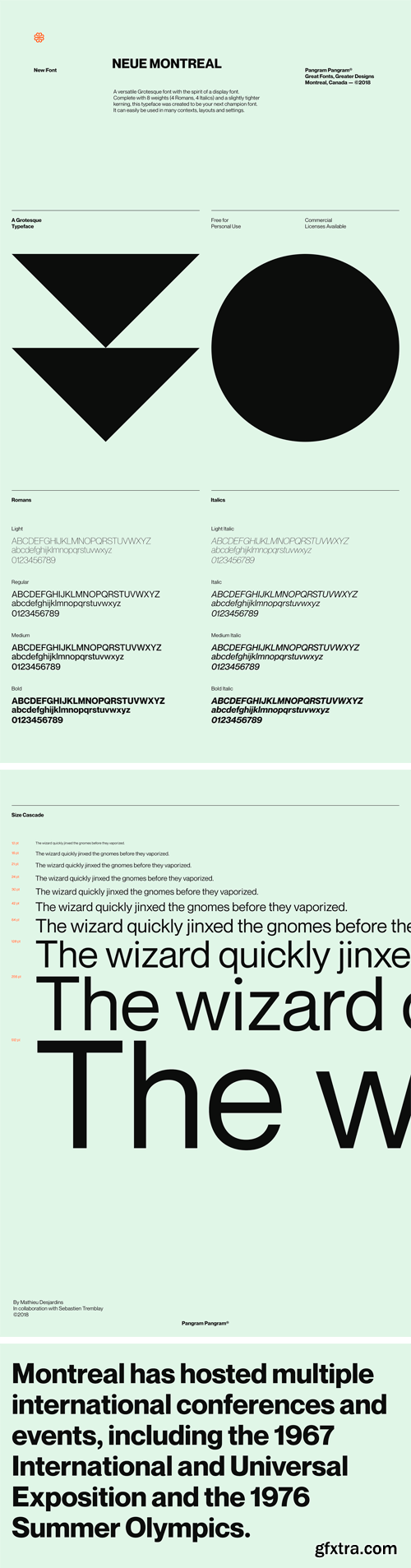
Neue Montreal Font Family
A versatile Grotesque font with the spirit of a display font. Complete with 8 weights (4 Romans, 4 Italics) and a slightly tighter kerning, this typeface was created to be your next champion font. It can easily be used in many contexts, layouts and settings.

https://www.myfonts.com/collections/montreal-serial-font-softmaker


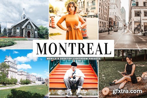
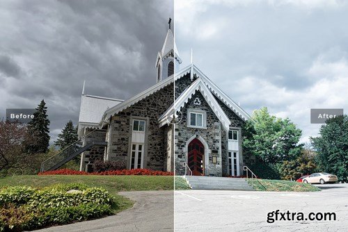
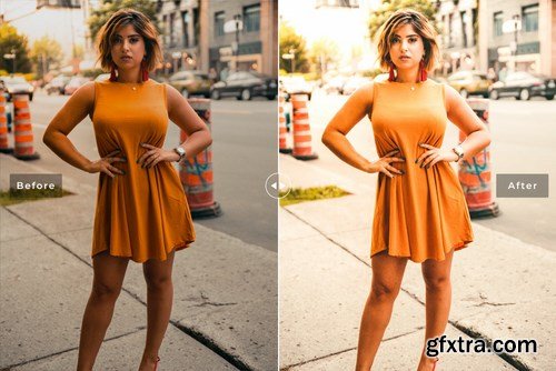
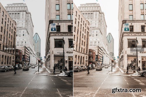
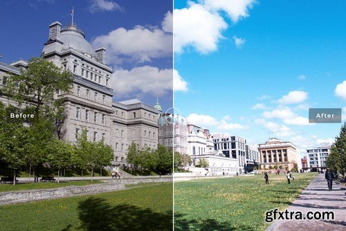
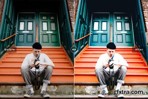
Montreal Mobile & Desktop Lightroom Presets will help you achieve sharp, glowing moody and professional tones that have the perfect, professional touch in your photographs with one click of a button. These presets work in a non-destructive way to achieve a high quality look.
Photoshop ATN | LRTemplate
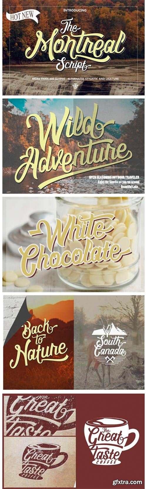
Montreal Script Font
Montreal is a nostalgic and sophisticated script with a cool vibe. Get inspired by its unique charm!


Neue Reman Grotesk contains 750 glyphs, a Latin Pro font that supports over 192 languages. This is the second version of the Neue Reman Family. It’s complete with Stylistic Alternates, Stylistic Set, Caps Swashes Letters, Standard Ligatures, Discretionary Ligatures, Tabular Figures, Proportional Figures, Superscripts, Subscripts, Scientific Inferiors, Fractions, Ordinals, Arrows and a variety of figures and fractions. Neue Reman typeface is suitable to use in multipurpose projects such as on websites, systems, printing, embedding, servers, screens, display, digital ads, branding, logos, titles, headlines, text, and everything else. The Grotesk glyphs style can be accessed with Opentype features. Make sure you use an App/Program that supports the Opentype feature.

https://www.myfonts.com/collections/neue-reman-sans-font-propertype
It is a Roman, Humanist, Grotesk, and Geometric sans serif family. The family comes in 7 weights & 5 Width with matching italics + Variable Font File and includes multilingual Latin characters. Neue Reman Sans contains 306 glyphs – this is the first version of the Neue Reman Family with standard ligatures and a variety of figures and fractions. We create Neue Reman typeface to use in multipurpose projects such as on websites, systems, printing, embedding, servers, screens, displays, digital ads, branding, logos, titles, headlines, teks, and everything else.

Originally designed in 1928, Plak is something of a lost gem in the type world. Despite being drawn by Futura creator Paul Renner, it never achieved the same popularity and spent decades lacking a much-needed digital revival. Monotype designers Linda Hintz and Toshi Omagari have taken its existing three weights and, after extensive research into the original wood type, extended them into the vast Neue Plak family. The typeface is available in 60 weights that stay true to Renner’s intentions, and offer the same blend of “quirky” details and “German stiffness” – as Hintz describes it. The design is an unusual mixture, bringing together a defiant outer appearance that’s counteracted by more playful details found in the lowercase r, and the large dots of the lowercase i. Other distinctive details include open or strikethrough counters, and a set of hairline widths that reduce Renner’s original design to its bare bones. Neue Plak’s display weights are crying out to be used in editorial, on packaging or in logos, while its text weight works well in both print and digital environments.
SermonBox - Seasonal Collection

SermonBox - The Series Pack Collection

Top Rated News


Would you like to be a Author?


